Docs
v.Latest
Introduction
Core Concepts
Querying Content
Editing
Customizing Tina
Going To Production
Media
Drafts
Guides
Framework Guides
Migrating From Forestry
Further Reference
Schema
Search
Content API
Self-Hosted Components
Custom List Rendering
If list is true the default label is often not very useful to editors.
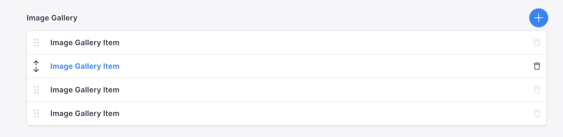
The label used for list items can be customized using the itemProps function. The main use-case for this is to provide a custom label based on the data in the component.
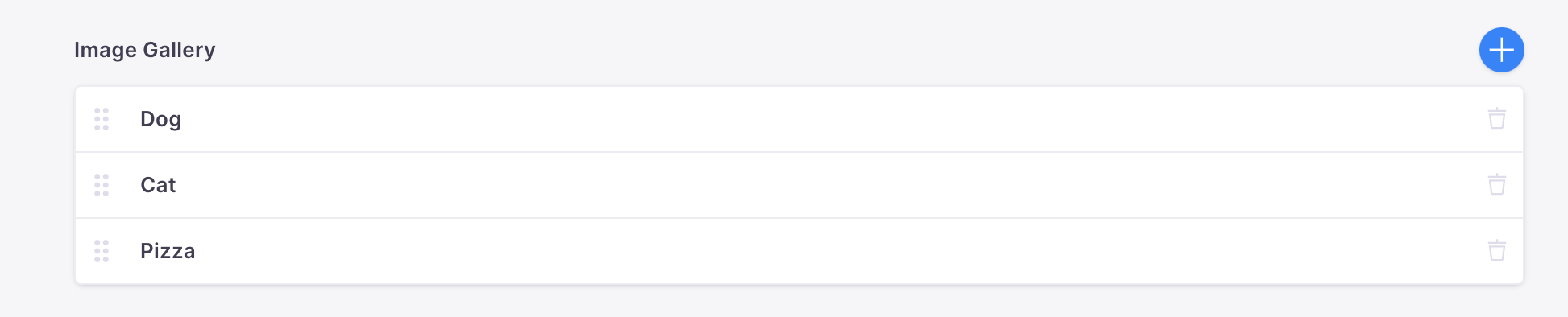
For example, to use the title field as the label for this image gallery collection:
// ...Other fields{label: "Image Gallery",name: "gallery",type: "object",list: true,ui: {itemProps: (item) => {// Field values are accessed by item?.<Field name>return { label: item?.title };},},fields: [{label: "Title",name: "title",type: "string",},{ label: "Image", name: "image", type: "image" },{label: "Size",name: "size",type: "string",options: ["sm", "med", "lg", "xl"],},],};
which will render as:
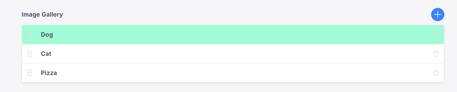
Although providing a custom label is the most common use-case of itemProps, the className and style props can also be returned to allow custom styling of the list component.
For example:
// ...Other fields{label: "Image Gallery",name: "gallery",type: "object",list: true,ui: {itemProps: (item) => {if (item?.title === "Dog") {return { label: item?.title, style: { backgroundColor: "blue" } };}// Field values are accessed by item?.<Field name>return { label: item?.title };},},fields: [{label: "Title",name: "title",type: "string",},{ label: "Image", name: "image", type: "image" },{label: "Size",name: "size",type: "string",options: ["sm", "med", "lg", "xl"],},],}
which will render as:
Video Tutorial
For those who prefer to learn from video, you can check out a snippet on "Customizing List Items" from our "TinaCMS Deep Dive" series.
Table of Contents
© TinaCMS 2019–2025